Power to the people
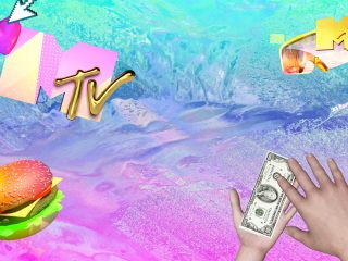
MTV International launched a new rebrand, not focusing on the way the channel looks, but on the way the brand behaves and how it relates to our audience completely. We moved from “I WANT MY MTV” to “I AM MY MTV”; giving our audience control of the channel in order to create their own interpretation of the brand.
Shorter communication
The challenge in 2015 lied in rebranding MTV to create a new brand more dynamic, responsive and relevant in culture. Focusing on what was important to our viewers. Through this rebrand, MTV international adapted its whole brand communication to a new content language: quick, bite size & visual.
This translated into shorter, louder and hyper-visual promotional content, allowing the brand to engage in a conversation with the audience in the same language and spaces that they interact everyday.
A new platform
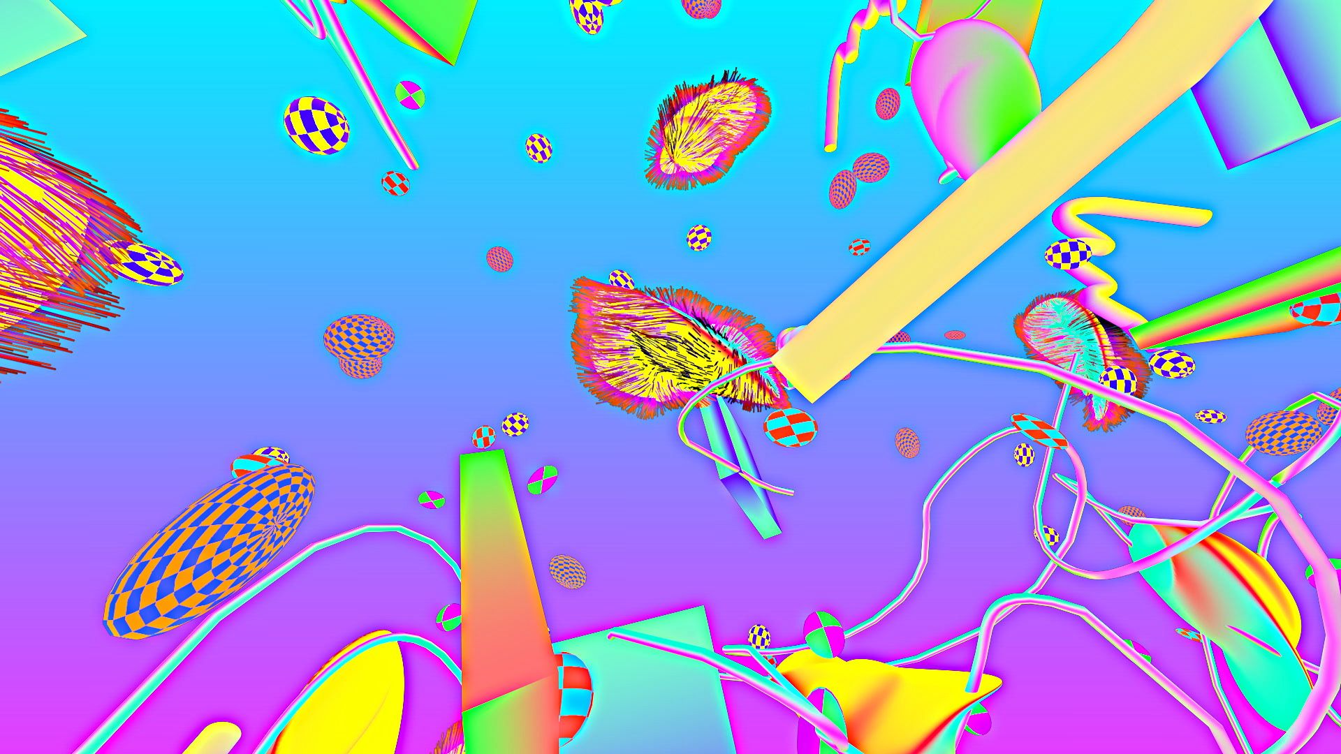
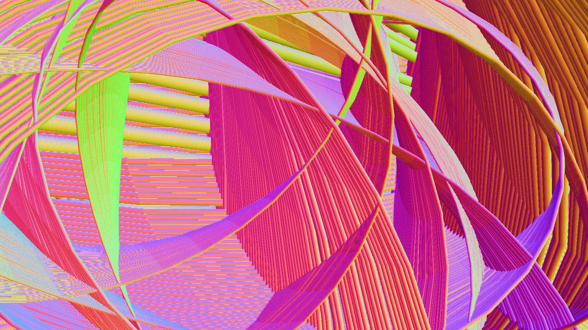
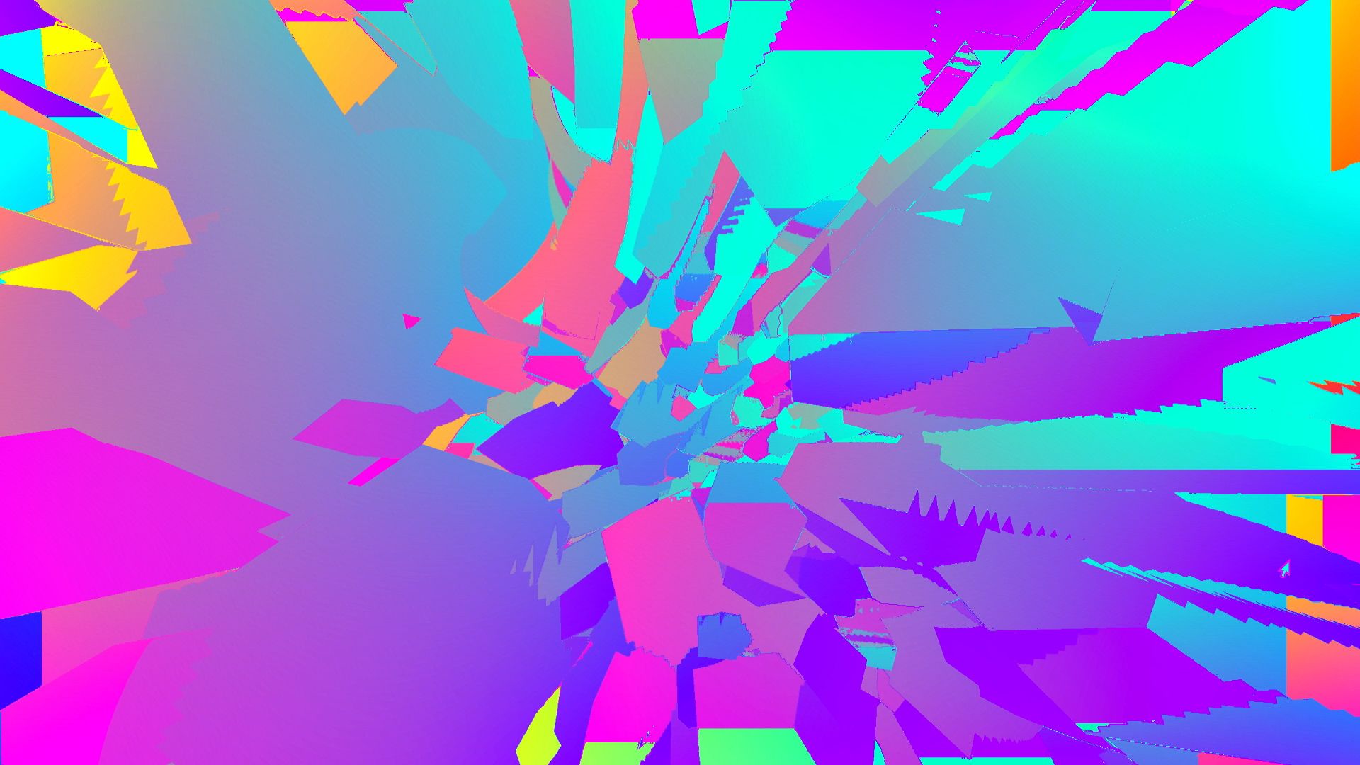
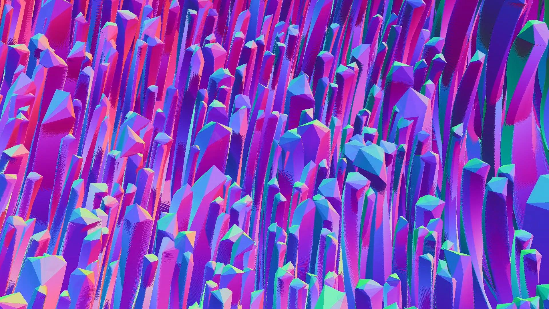
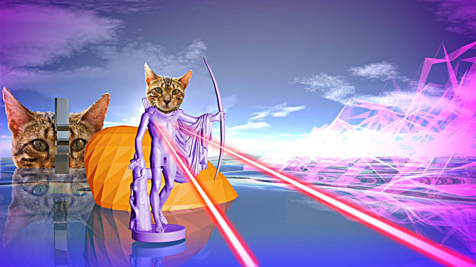
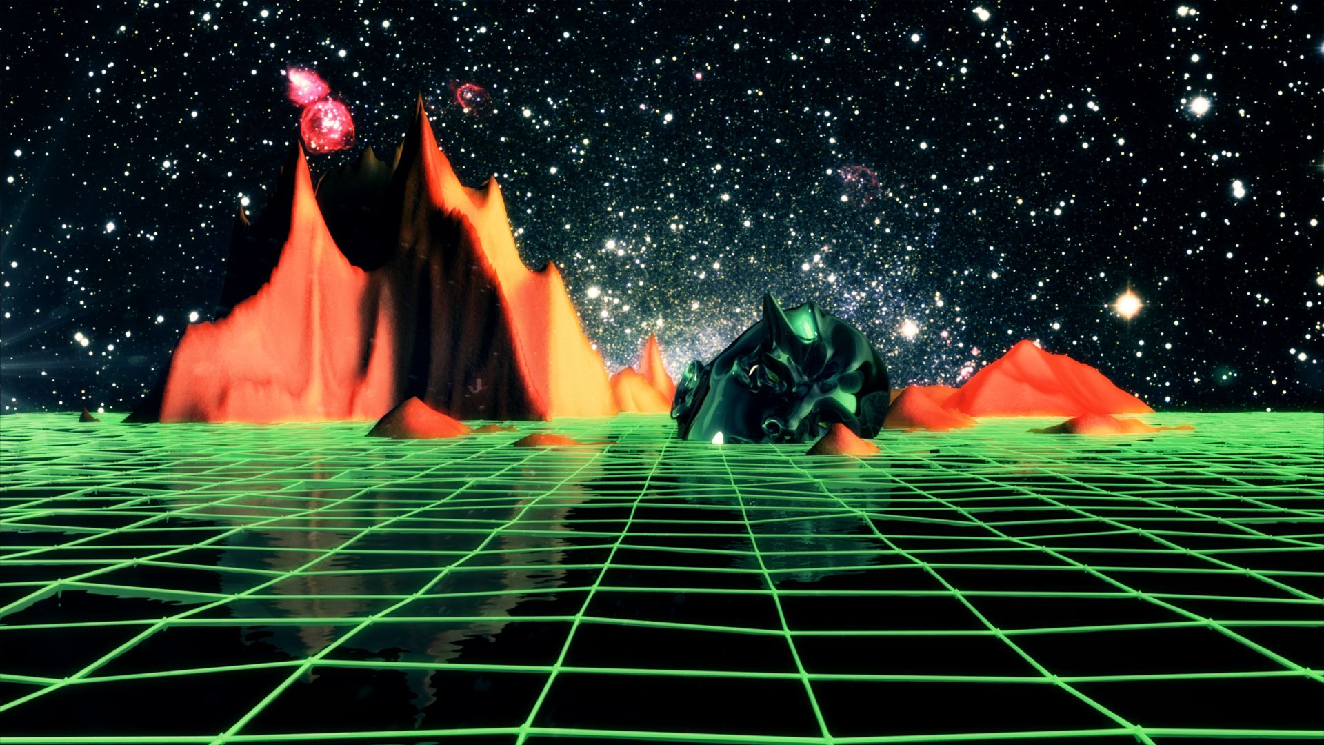
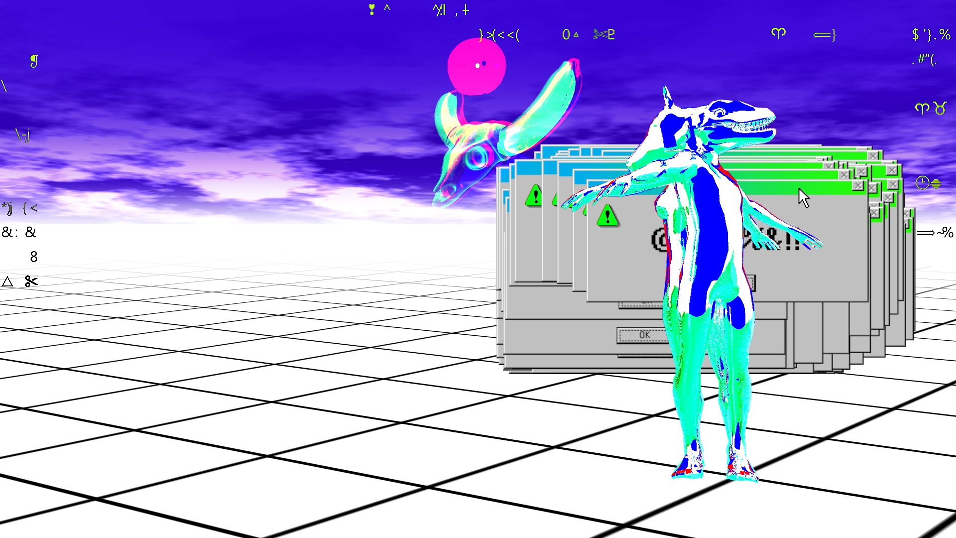
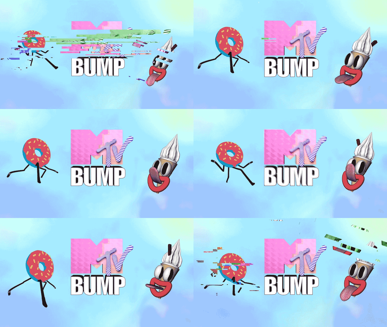
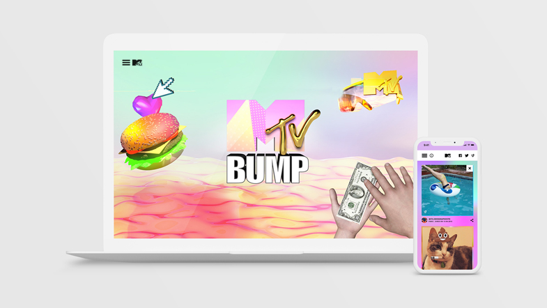
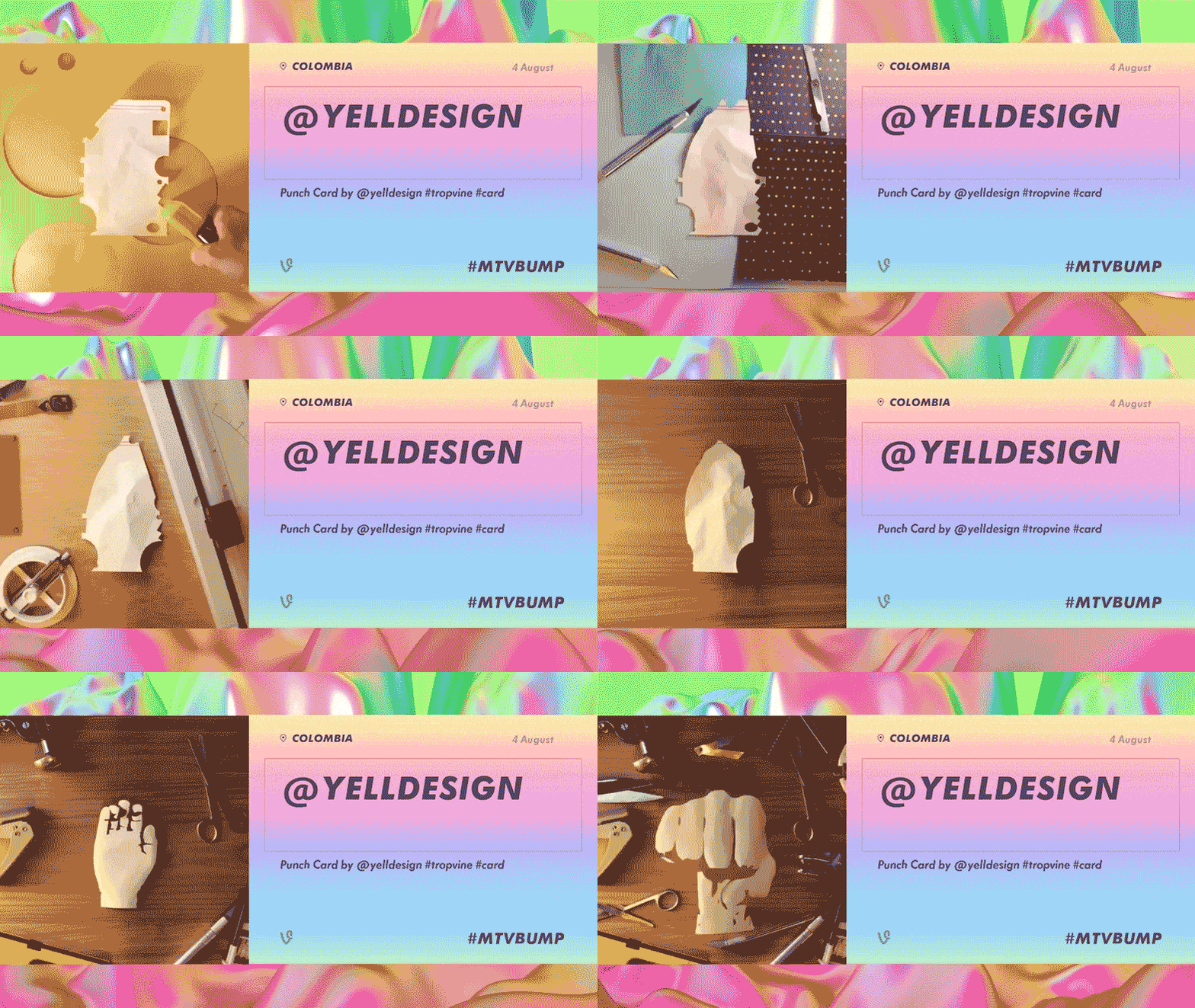
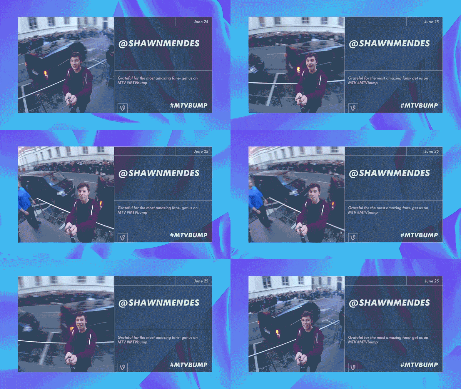
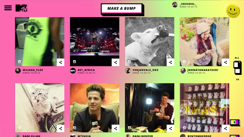
To let people create their own interpretation of the brand, we redesigned the way the art breaks work. On one hand, we created MTV Bump, a responsive web based platform that connects the internet to the TV, allowing the audience to create Idents or Bumps (MTV’s traditional interstitial TV promos), with a series of different tools.
New voices
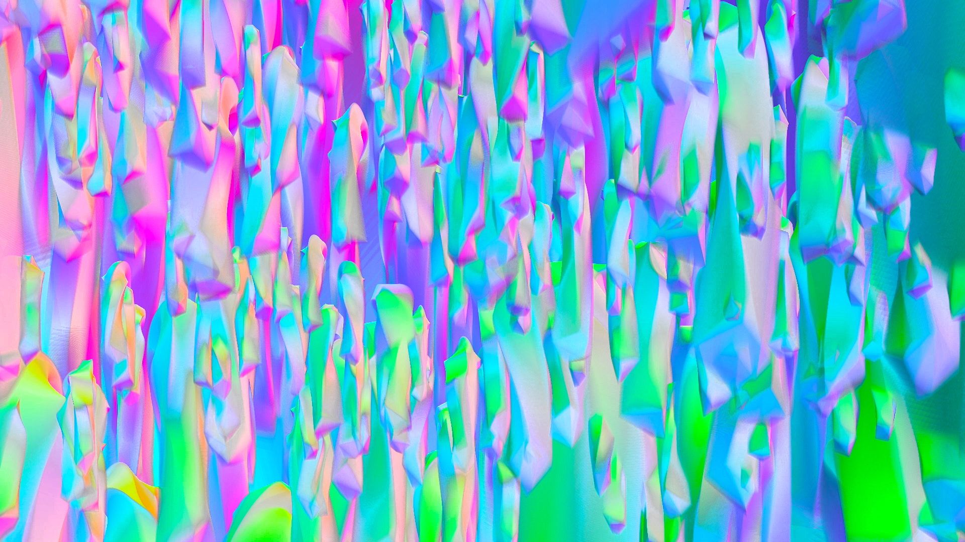
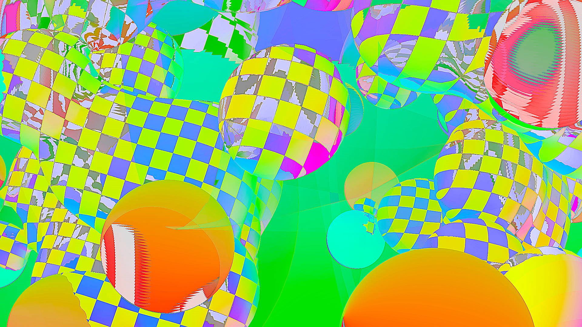
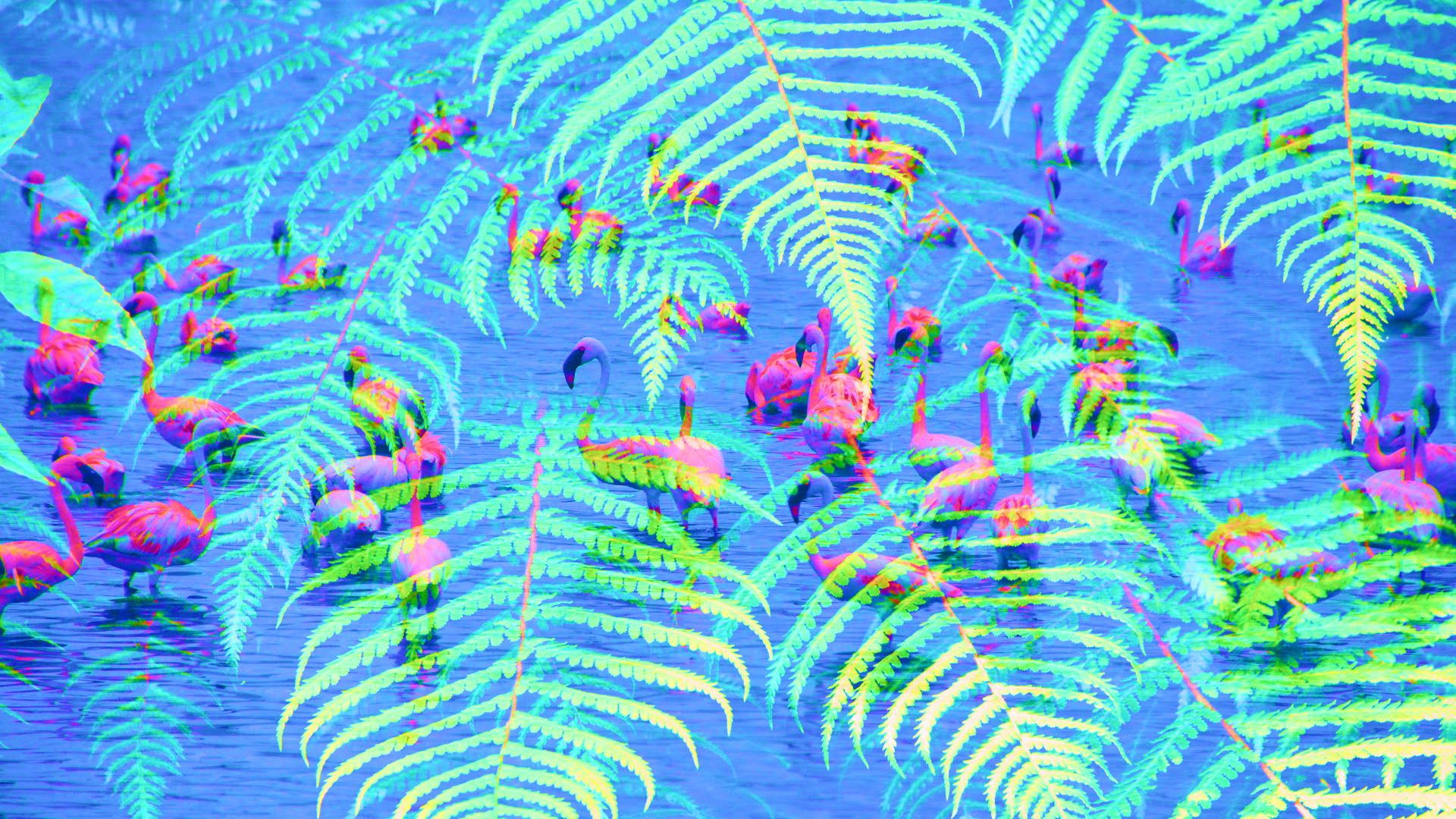
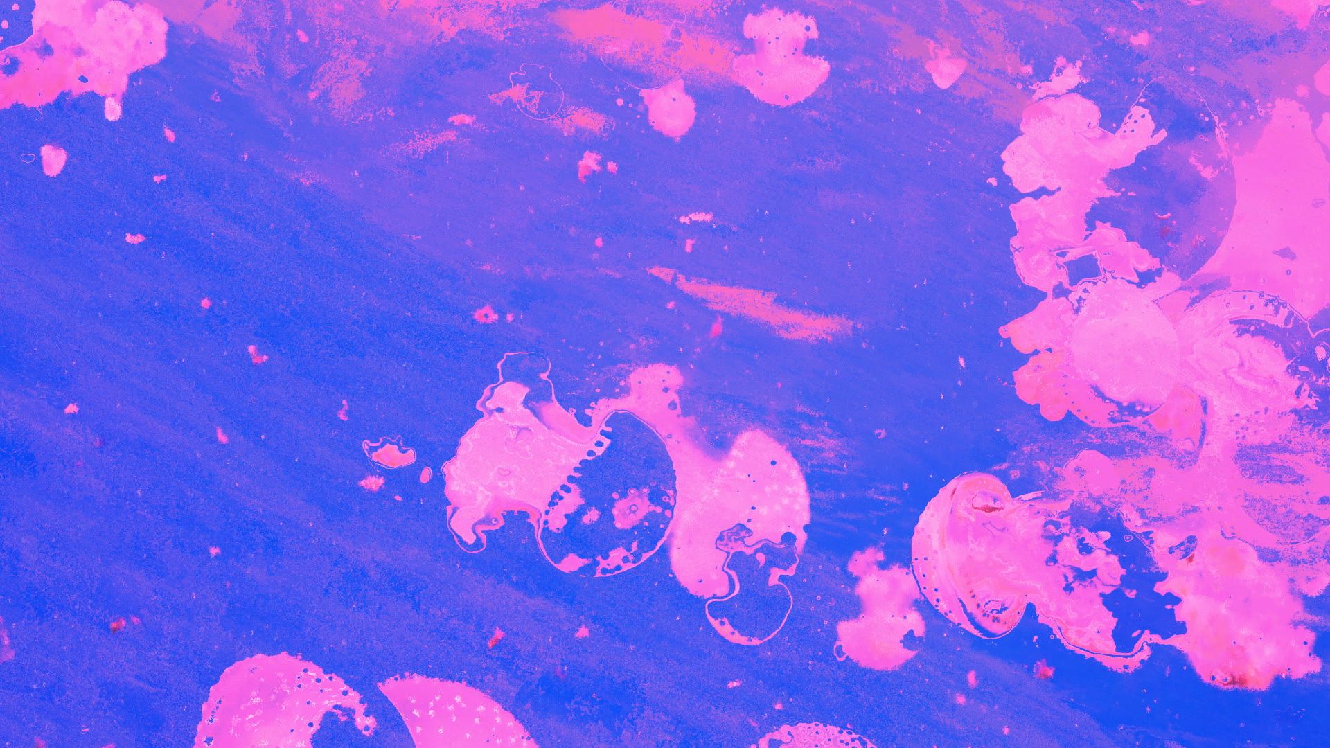
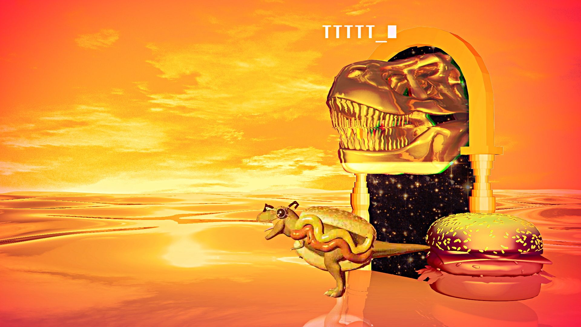
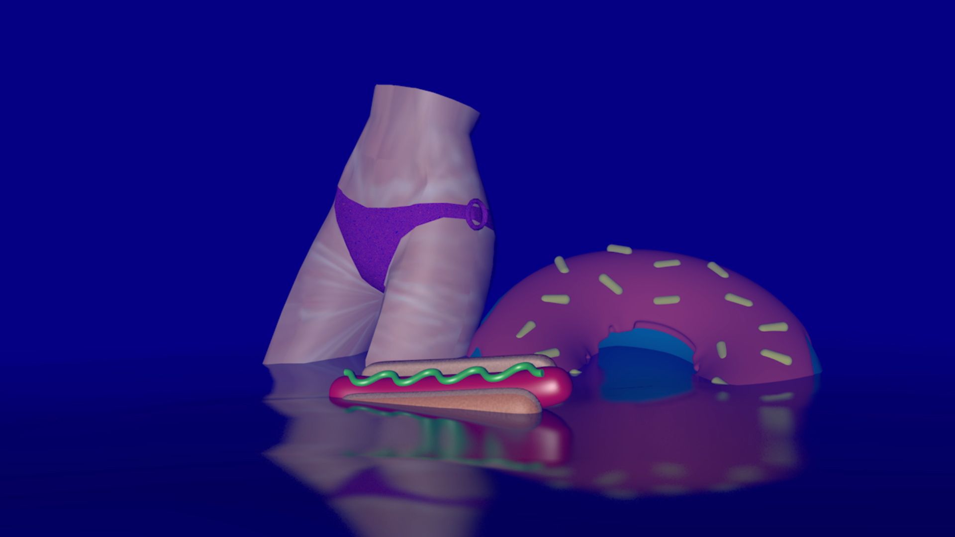
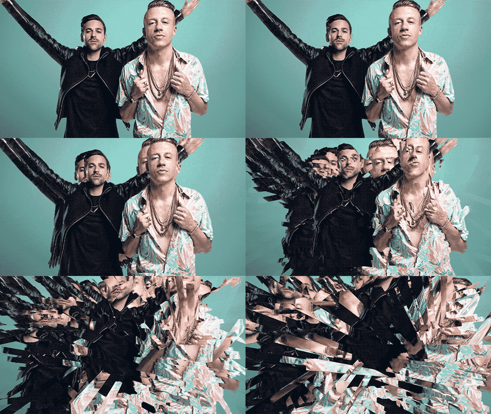
We’ve also let the control of the screen to young and upcoming artists, giving them total freedom to express their vision of the brand, generating a bigger and faster collection of idents. We’ve also acknowledge their work by crediting their pieces.
The Logo
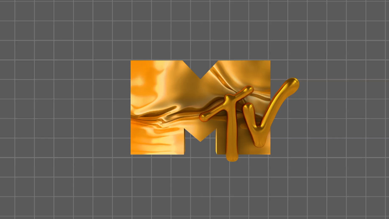
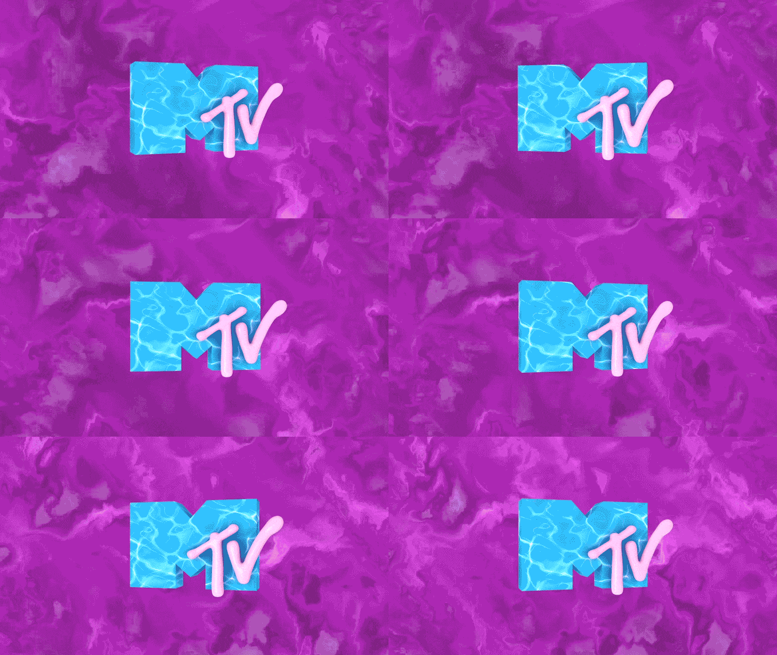
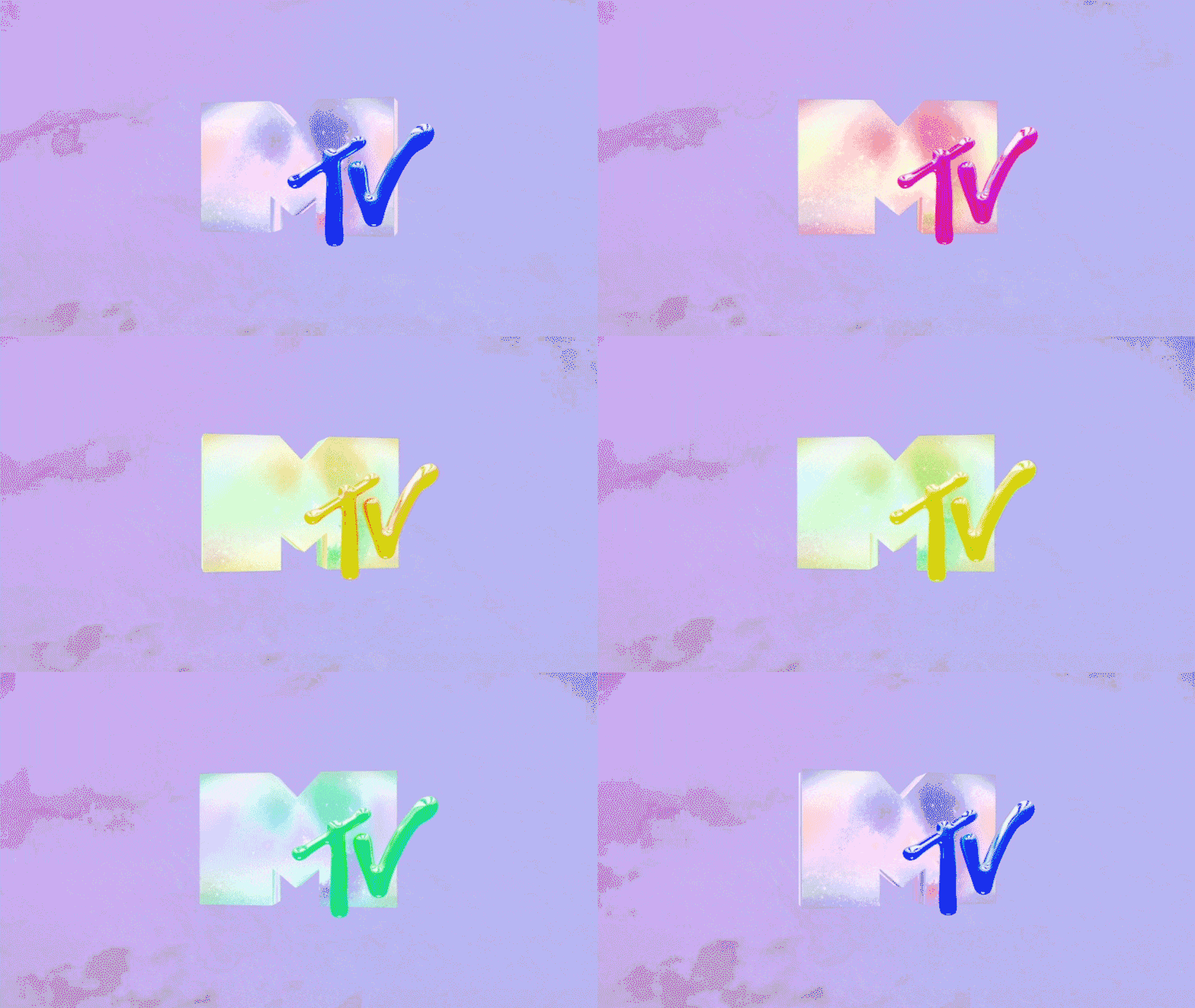
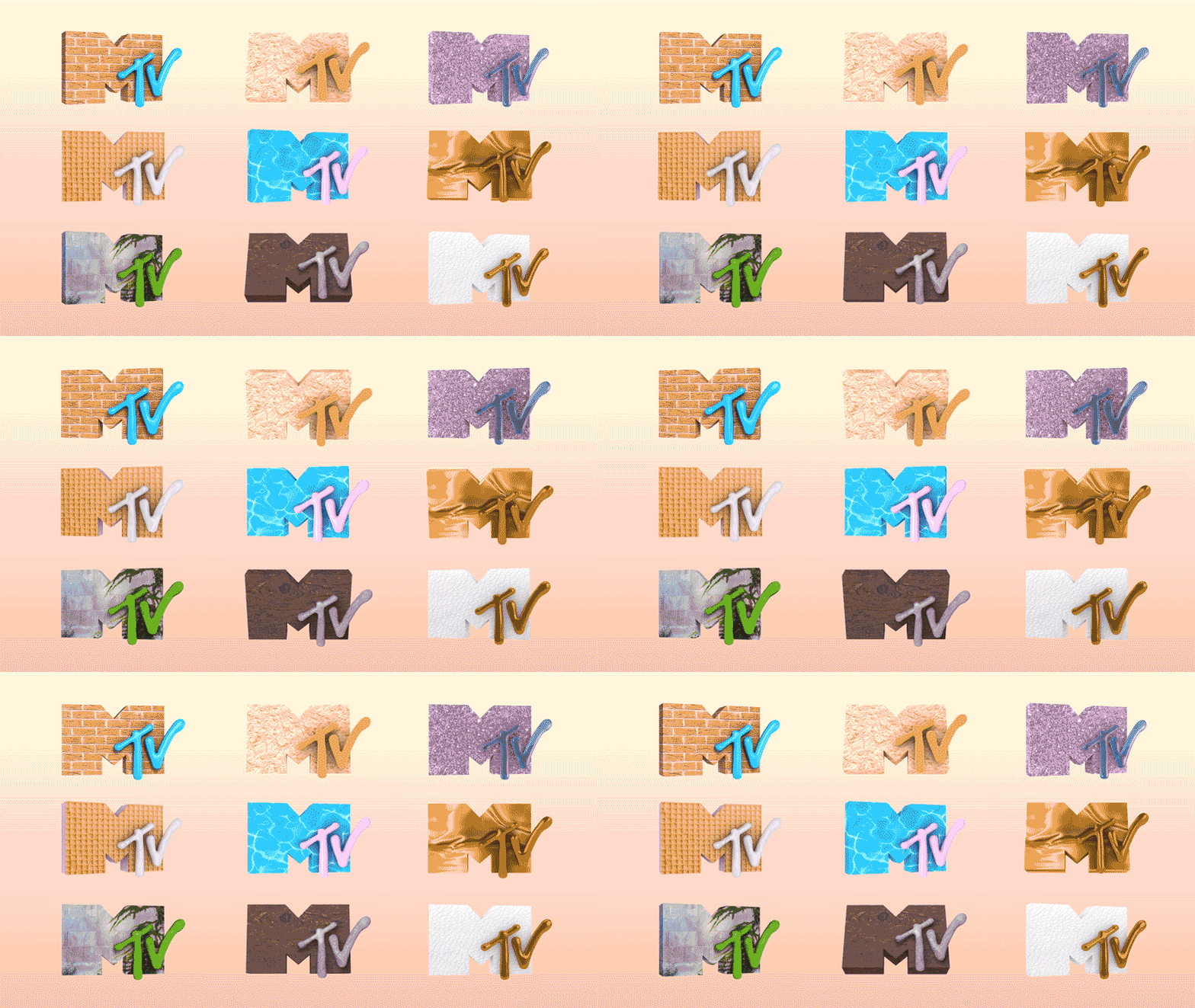
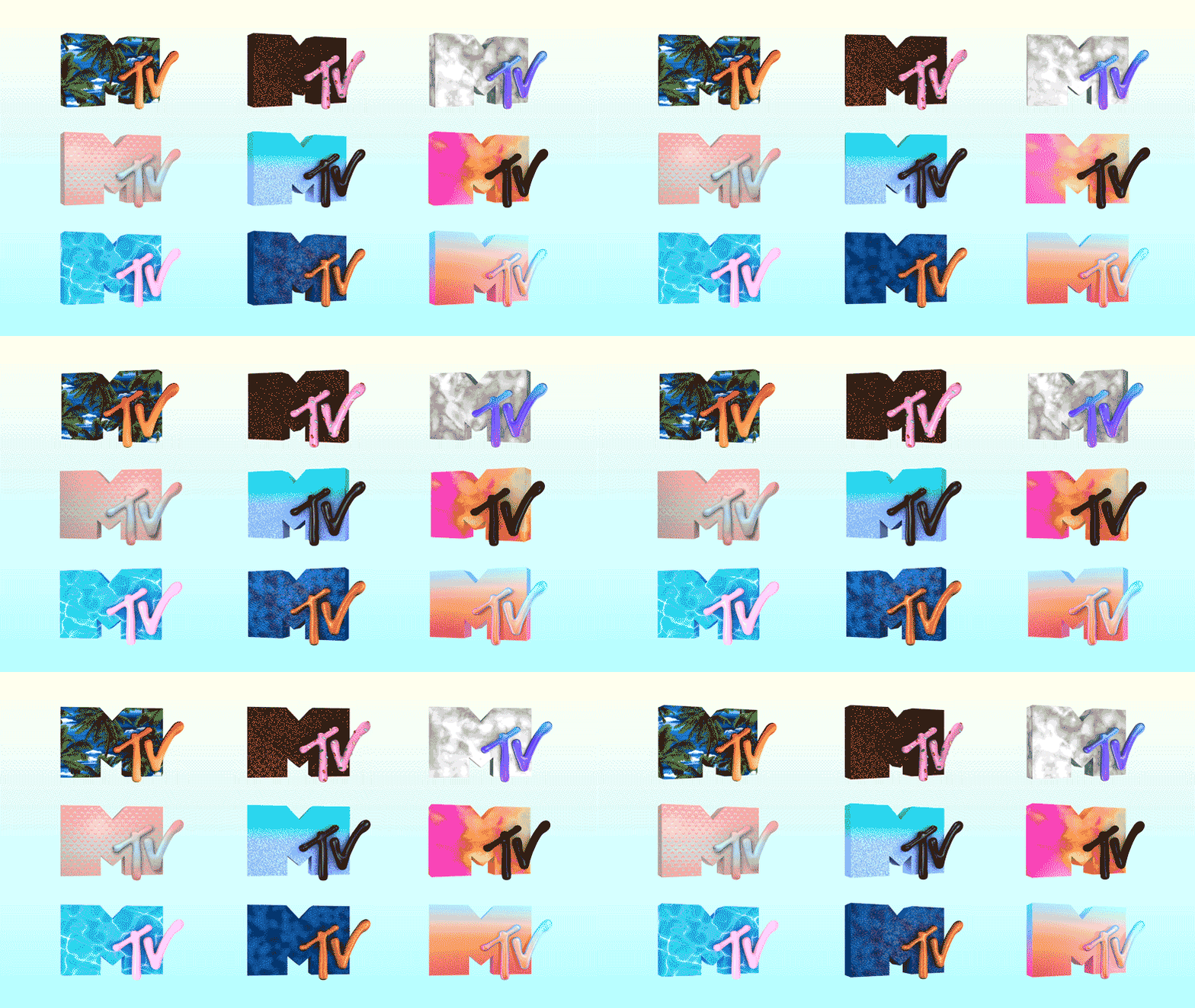
Under the “I AM MY MTV” concept, we’ve also made the iconic MTV logo open for manipulation, allowing artists and designers to create their own versions once again.
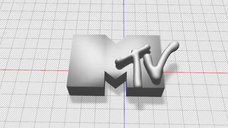
For the first time in MTV´s history, we created a unified 3D model to handle collaborators. The design process was focused on capturing the concept behind the original MTV logo by Manhattan Design (Pat Gorman, Frank Olinsky, and Patti Rogoff).
This was more challenging than it sounds, however, as the 3D effect in MTV’s 2D logo is impossible to create in 3D. It’s a fake perspective, so when you look at it in 3D from the front, you can’t see that same perspective. The solution was to create a flat M, with a 3D ‘T’ and ‘V’ popping out in front “to add character”.
We also created a massive library of audiologos for artists to choose from, matching their design with a unique voice.
Visual Identity
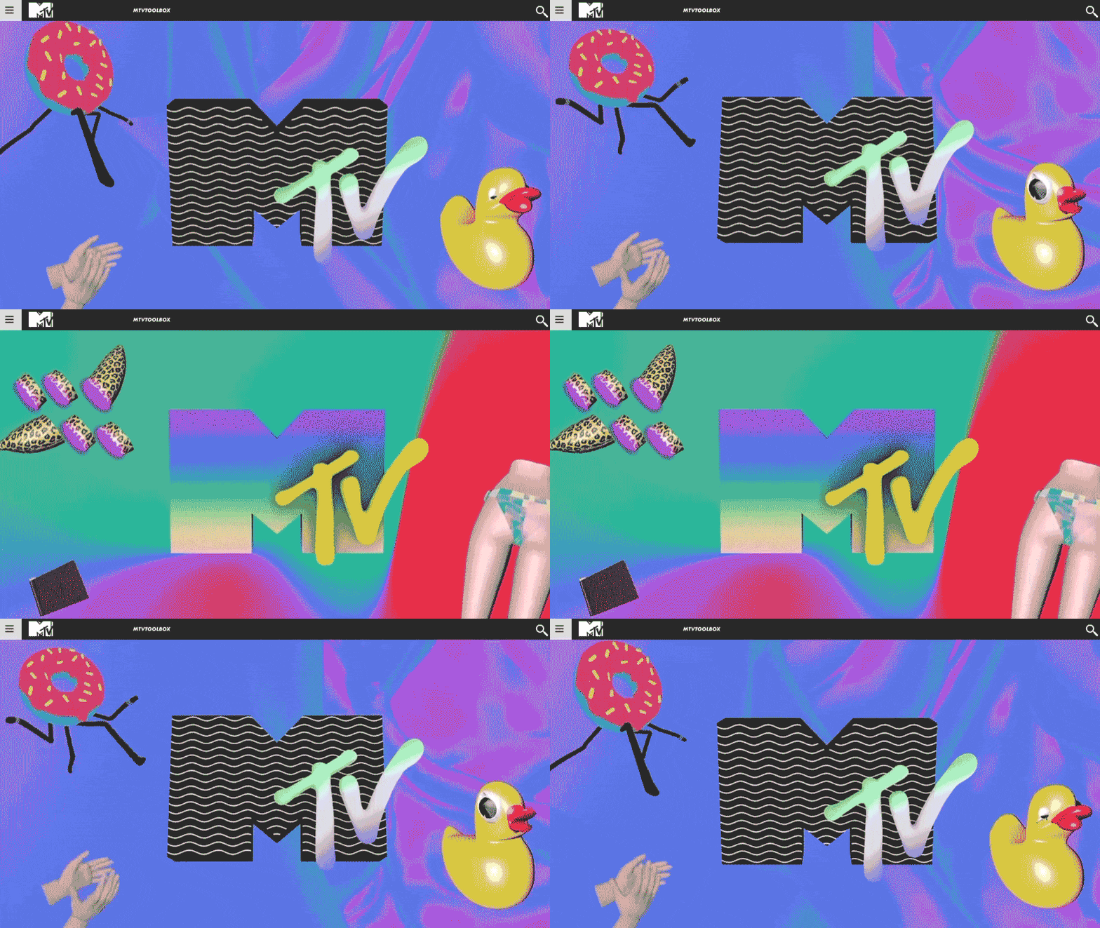
Traditionally, TV networks have lots of brand guidelines that define how a brand should look like. We wanted the identity of MTV to be dynamic, always-changing, so instead of a style-guide we created an online toolbox that contained a visual territory for MTV.
This digital toolbox talked about a philosophy and approach without necessarily specifying where things should be placed. We’ve really made it a lot easier for the regions and local creative teams to play around more with the elements, and at the same time, we’re able to refresh it every few months.
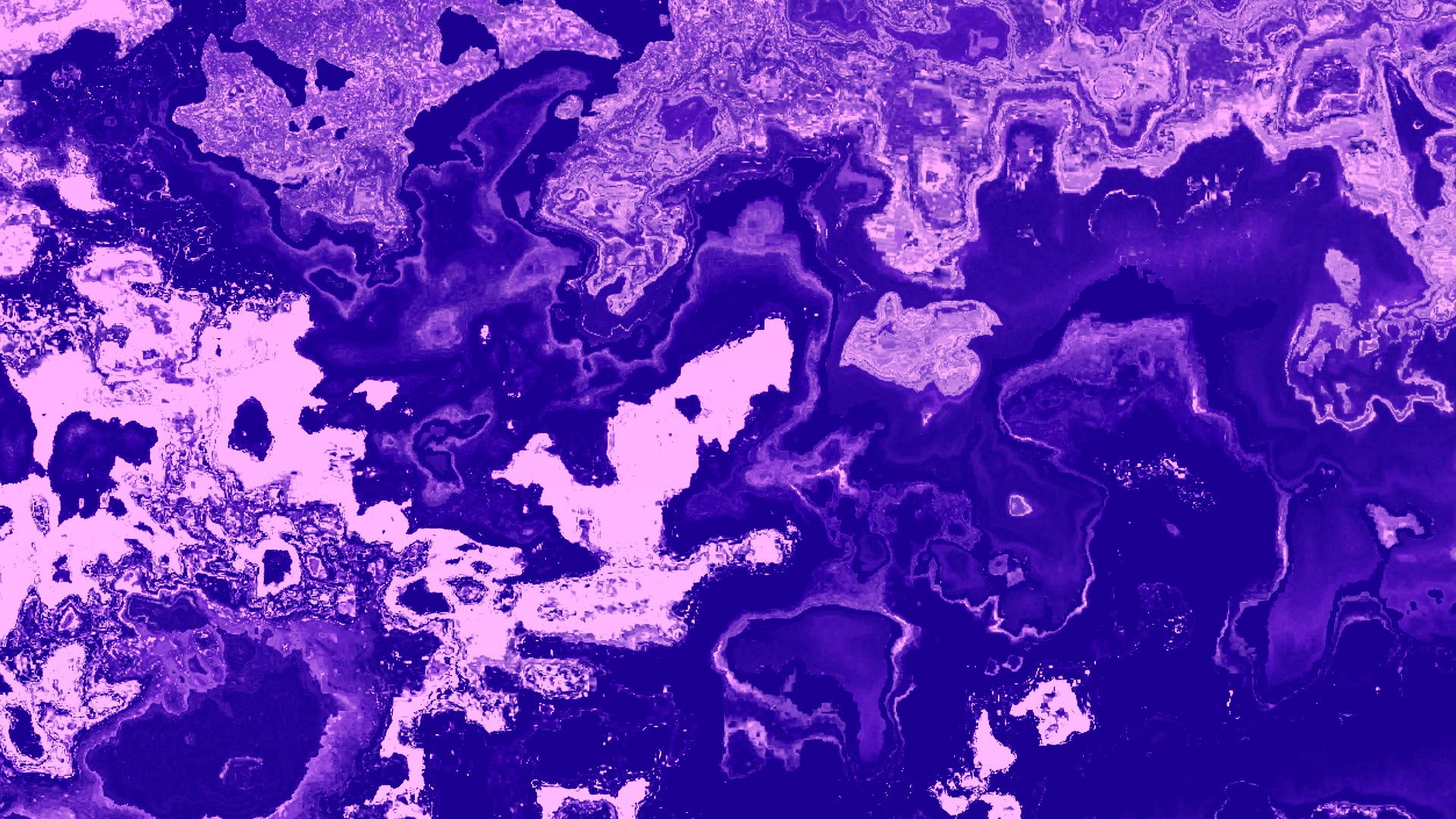
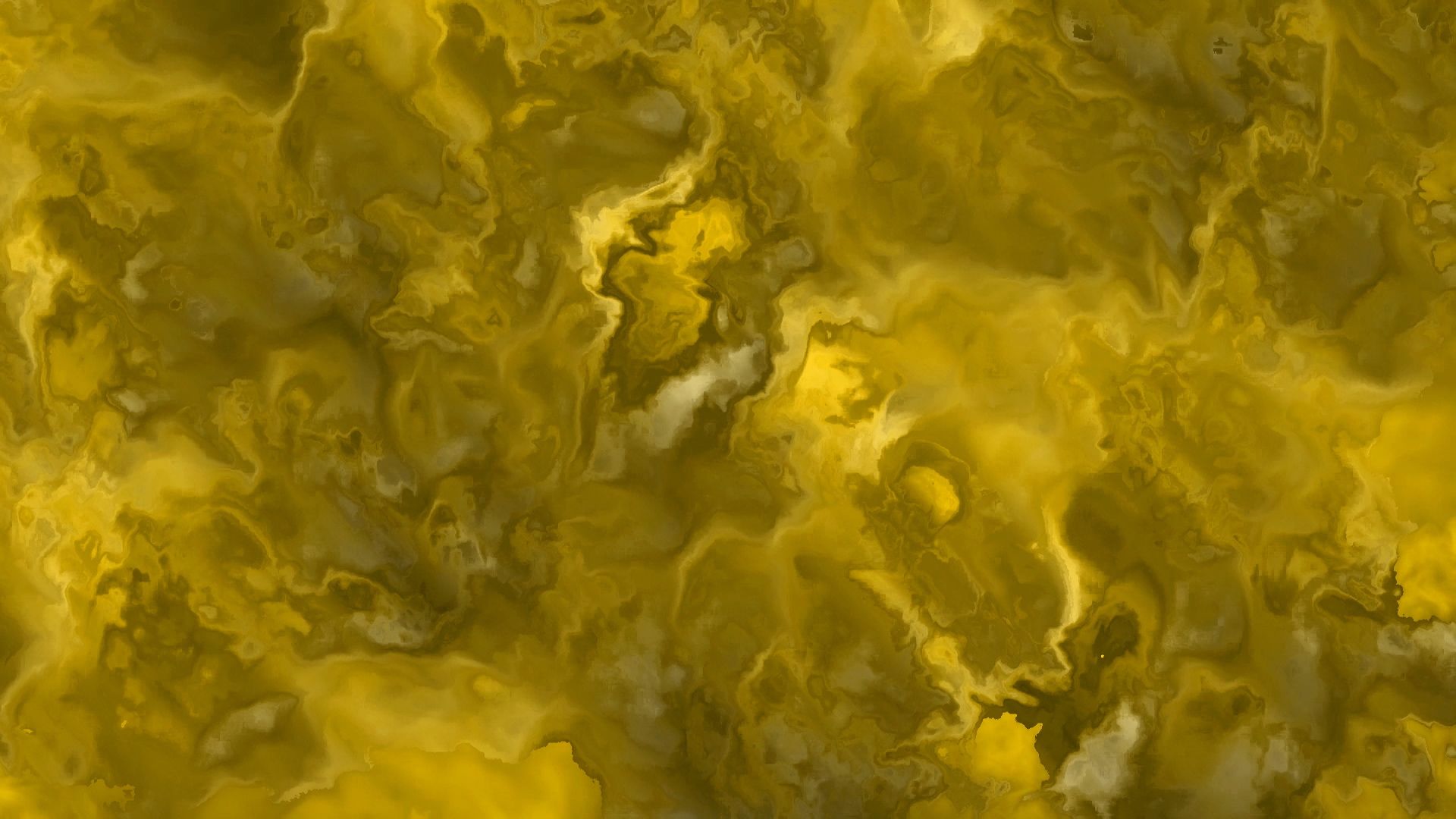
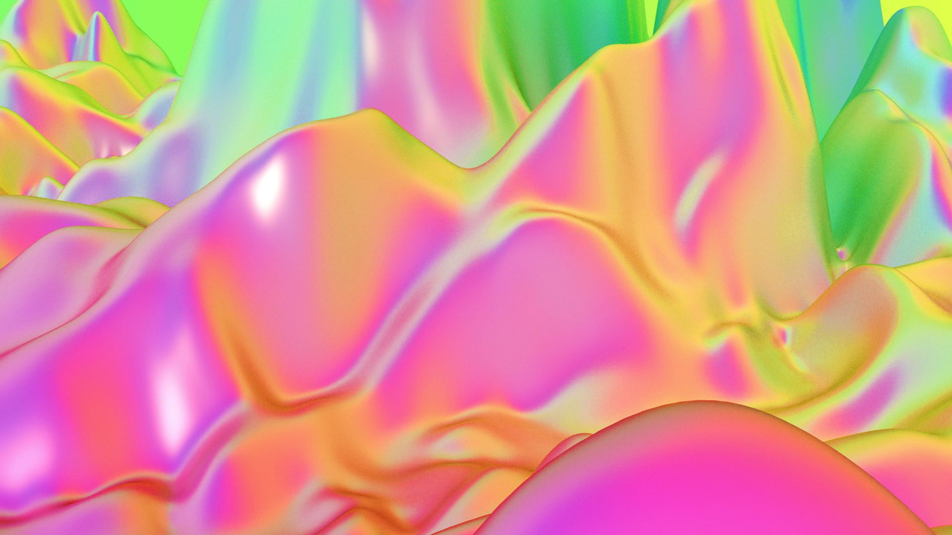
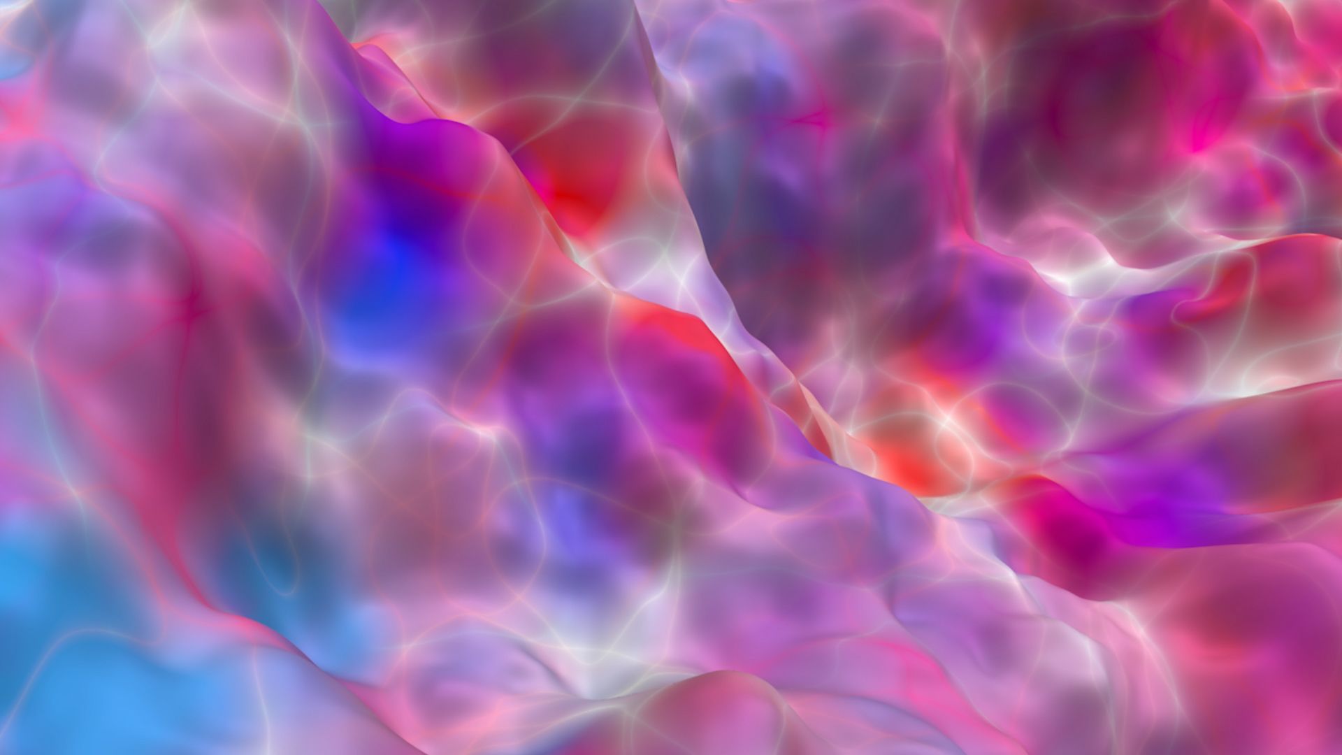
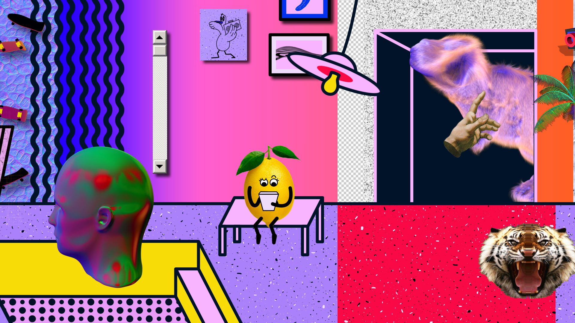
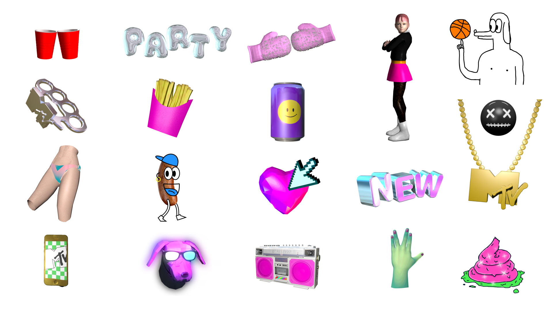
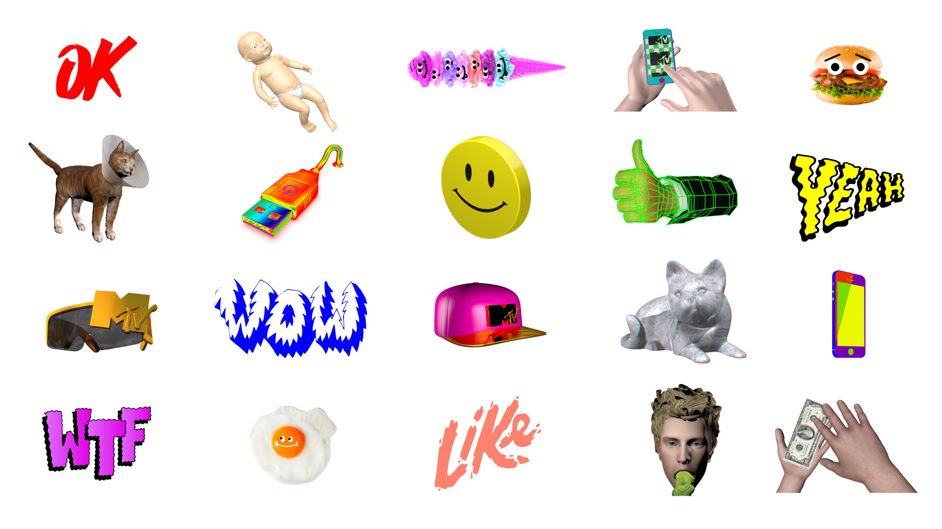
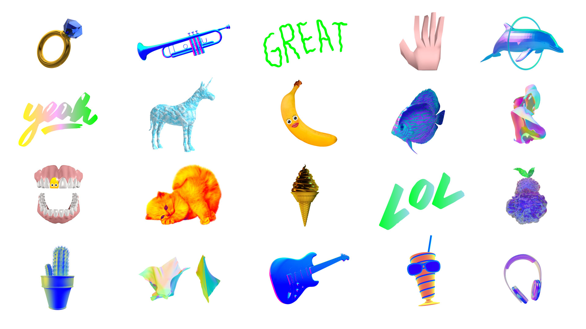
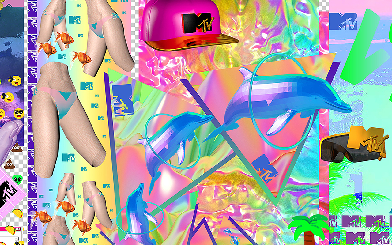
We have created a structure of elements – there are 300 different backgrounds, hundreds of animations and our own emojis…and regions can mix them up and create their own pieces, but they’ll always feel like they’re coming from the same place.
The toolbox lives online and is continuously built by the MTV creative community. This allows MTV to have a flexible but consistent brand voice.
IMPACT
We handed over the keys of MTV to our audience, and helped them turn it around by giving them new technology to make and share.
We amplified their voices and content from their feeds; to a global broadcast network available in more than half a billion households in more than 110 countries.
We’re currently airing more than 7000 pieces of user-generated content per week. That’s approximately equal to 7 seasons of any primetime show.
ACCOLADES
D&AD – Gold – Branding / Multi-Platform TV Branding & Promotions (2016)
D&AD – Bronze – Branding / Channel Branding & Identity (2016)
Promax Global – Gold – Art Direction & Design / Channel Image (2016)
Promax Global – Silver– Interactive Promotion (2016)
Communicator Awards – Gold – Integrated Campaign – Promotional/Branding (2016)
Art Directors Club – Merit – Branding Campaign (2016)
The One Club – Merit – Design & Branding (2016)
CREDITS
VP Creative: Sean Saylor – VP Marketing: Tanya Leedekerken – Creative Director: Nacho Gil – Creative Lead: Maxi Borrego – Designer: Nacho Varone – Director Digital Marketing Strategy: Mikael Fröberg – Production & Operation Director: Josefina Marfil – Lead Producer: Delfina Chiesa – Editors Supervisor: Martin Rocha


